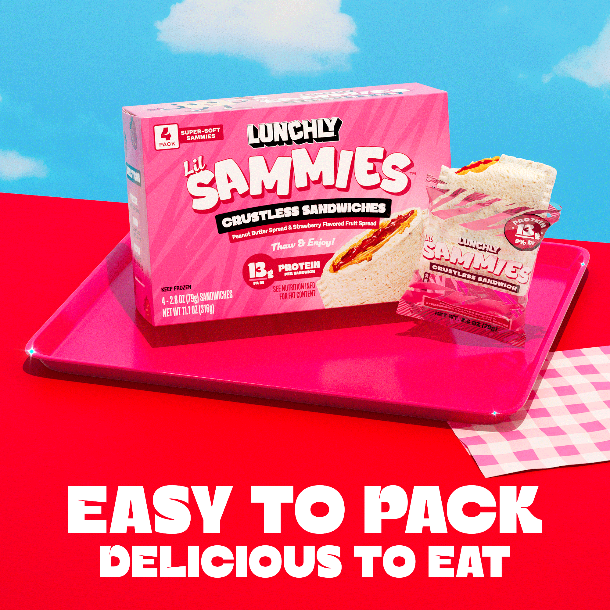
Lunchly Lil Sammies
Defining the Visual Direction for a New Product Line
With a broad brief to create a frozen sandwich product that could compete in the same space as Uncrustables, I developed the initial creative concepts and visual direction for Lunchly Lil Sammies.
Starting with very little prescribed creative direction, I explored multiple packaging approaches before developing the selected concept into a flexible system across flavors and SKUs. As the product moved toward launch, I remained the primary creative point of contact for Sammies, helping guide how the brand extended beyond packaging into CG imagery, e-commerce and additional launch touchpoints.
ROLE
Creative Concepting / Art Direction / Packaging Design
SCOPE
Visual Direction · Multi-SKU Packaging · Art Direction · CG Concepting · PDP Design
Building the System
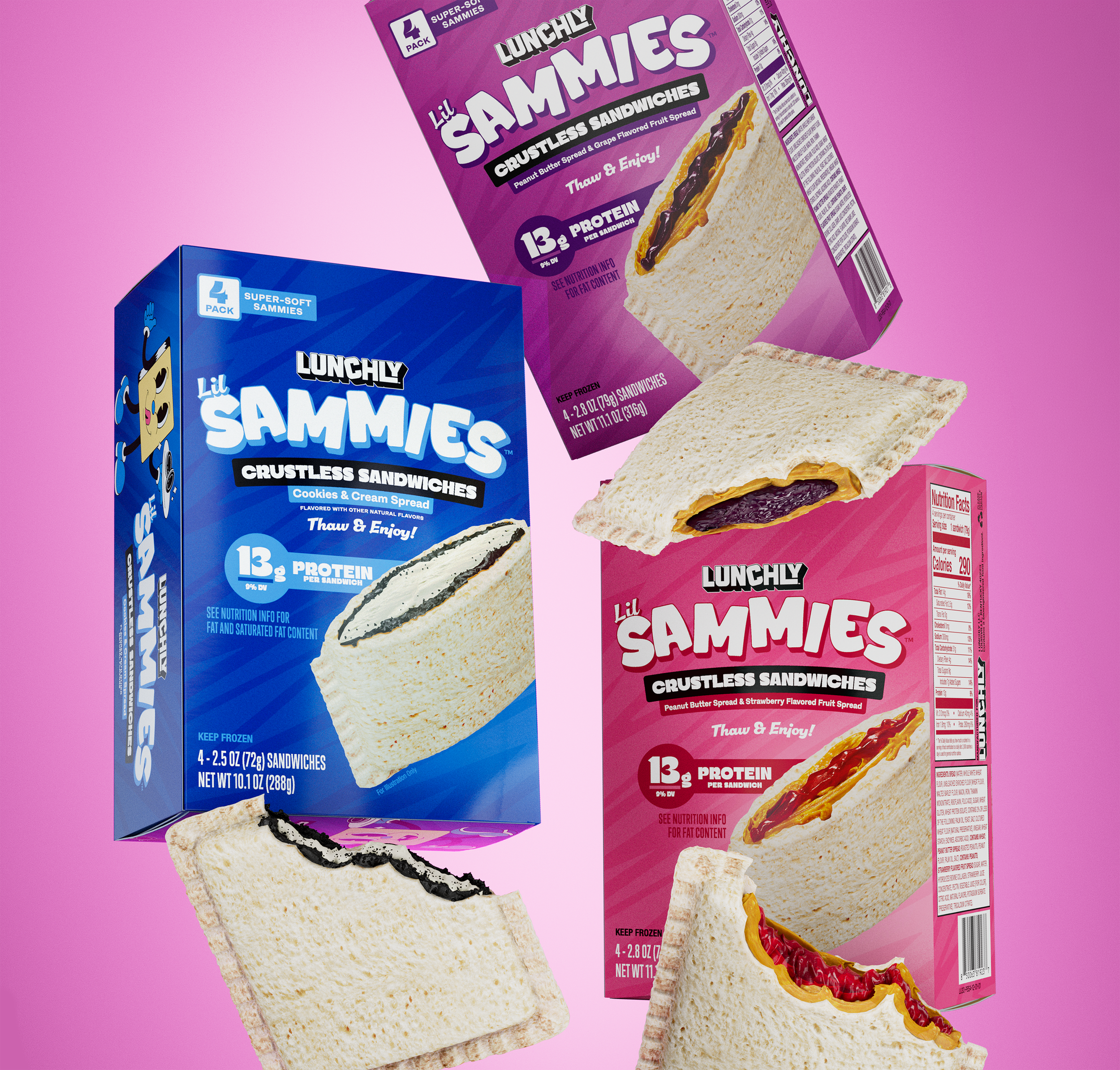
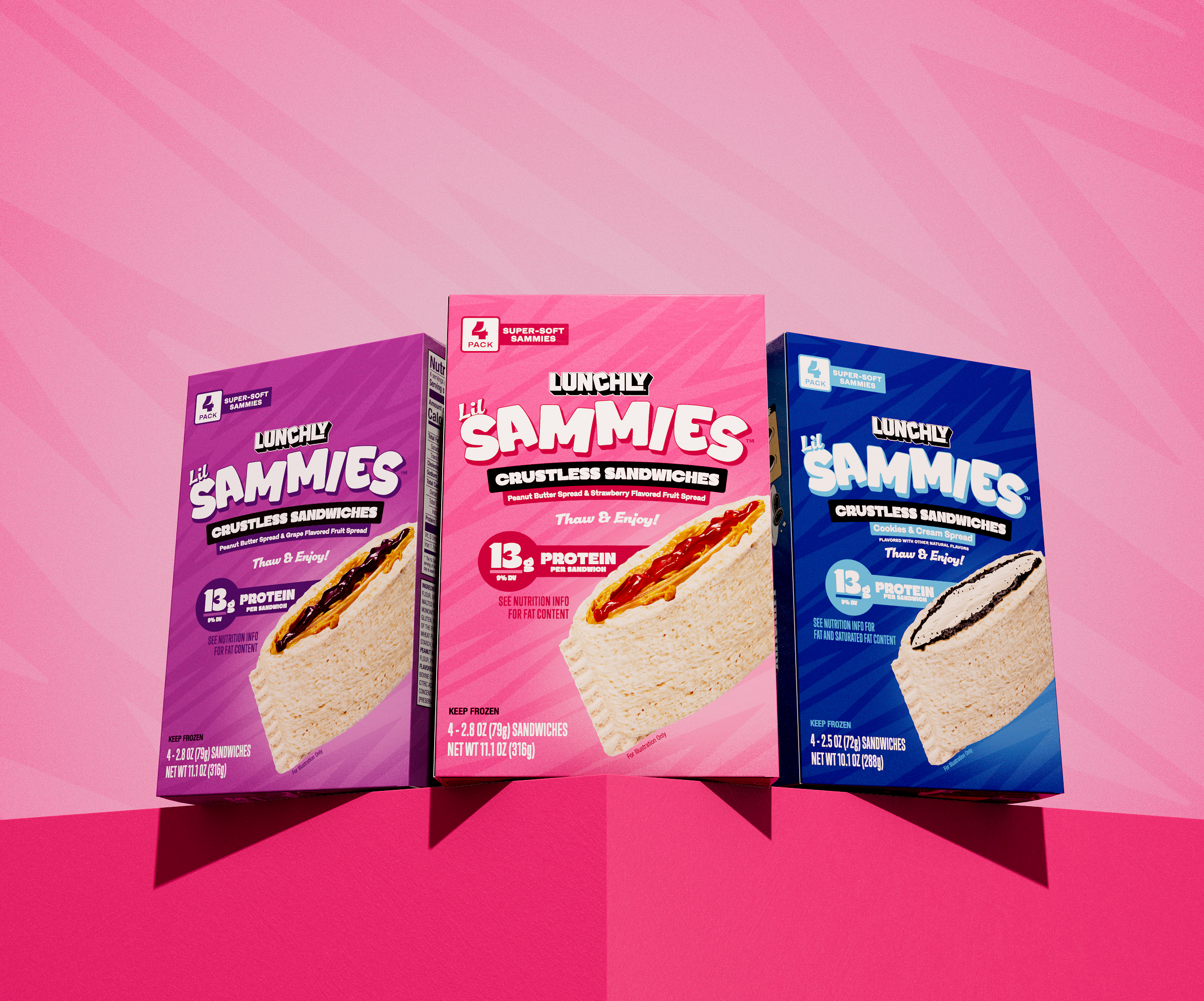
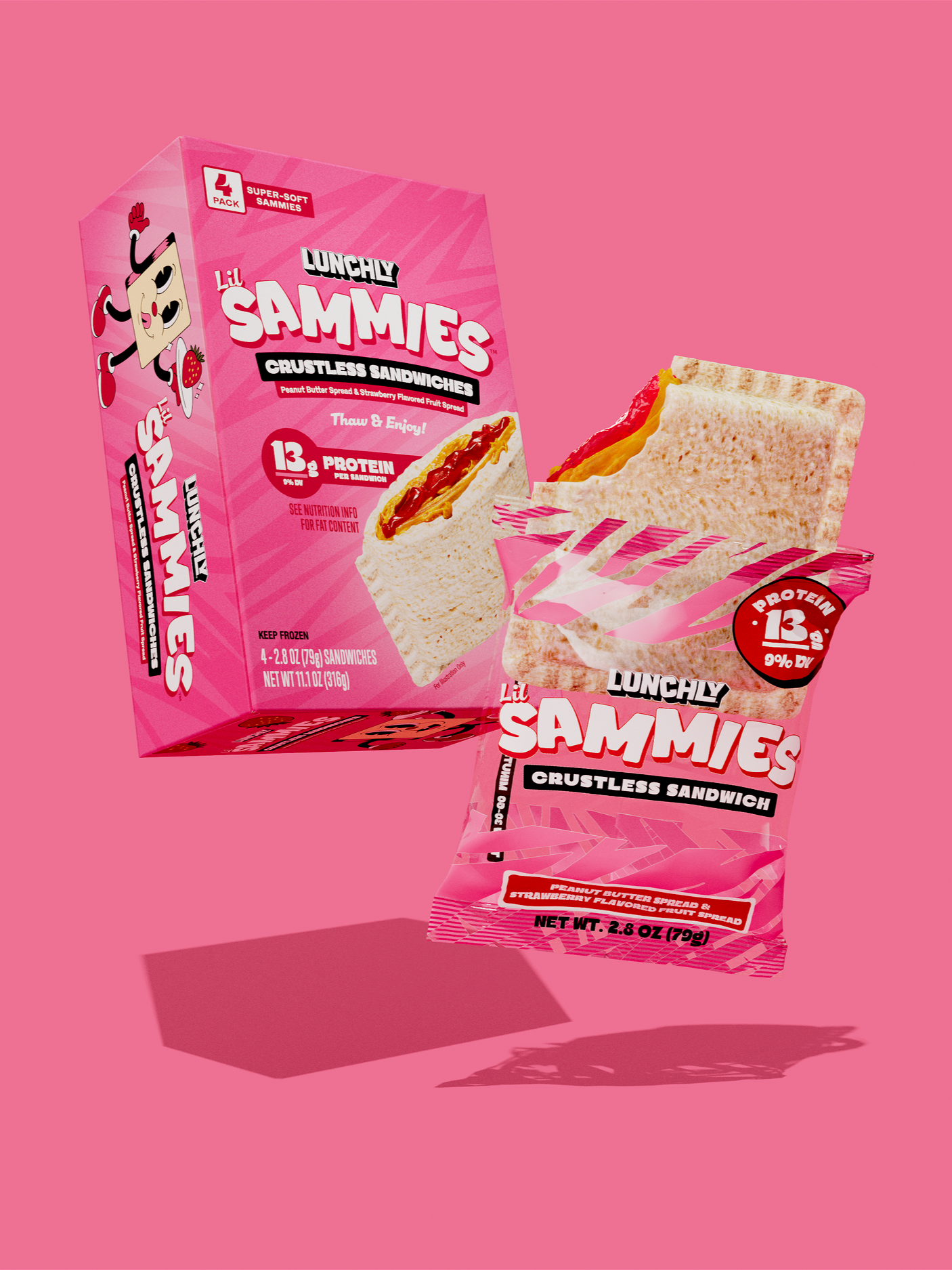
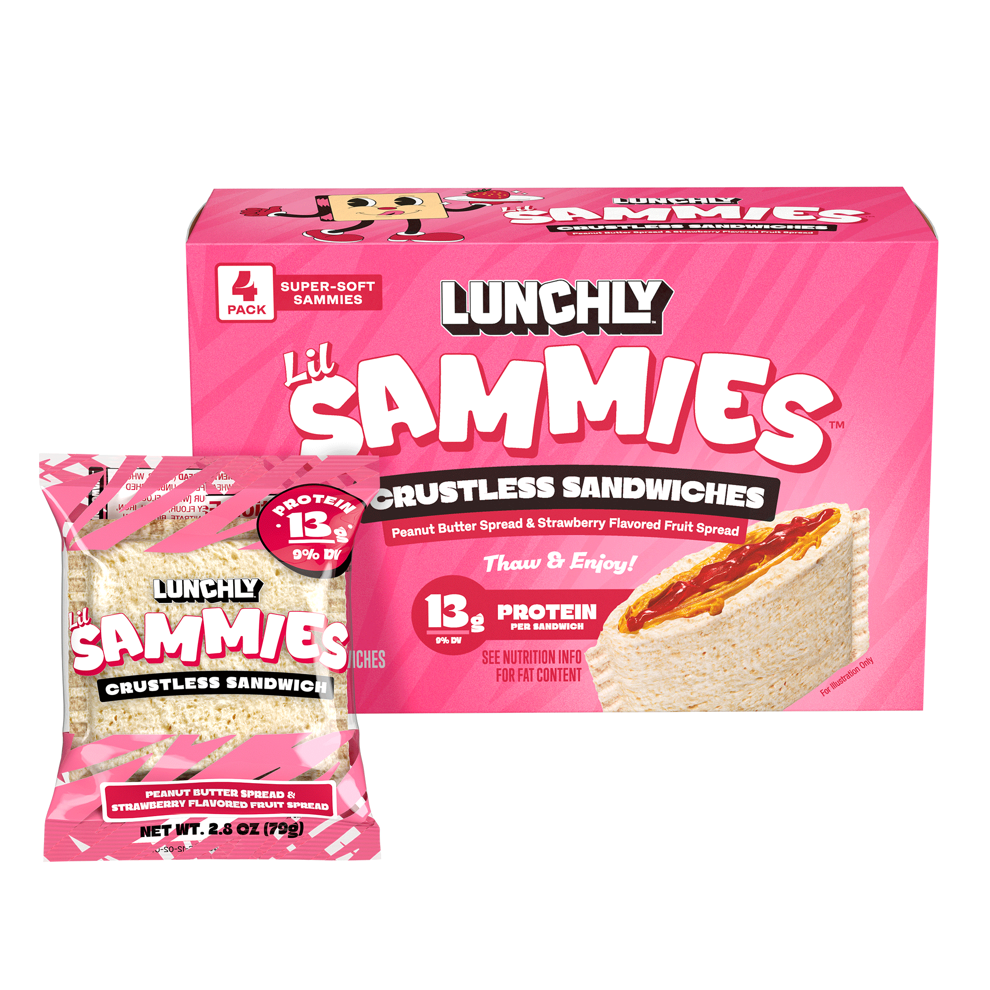
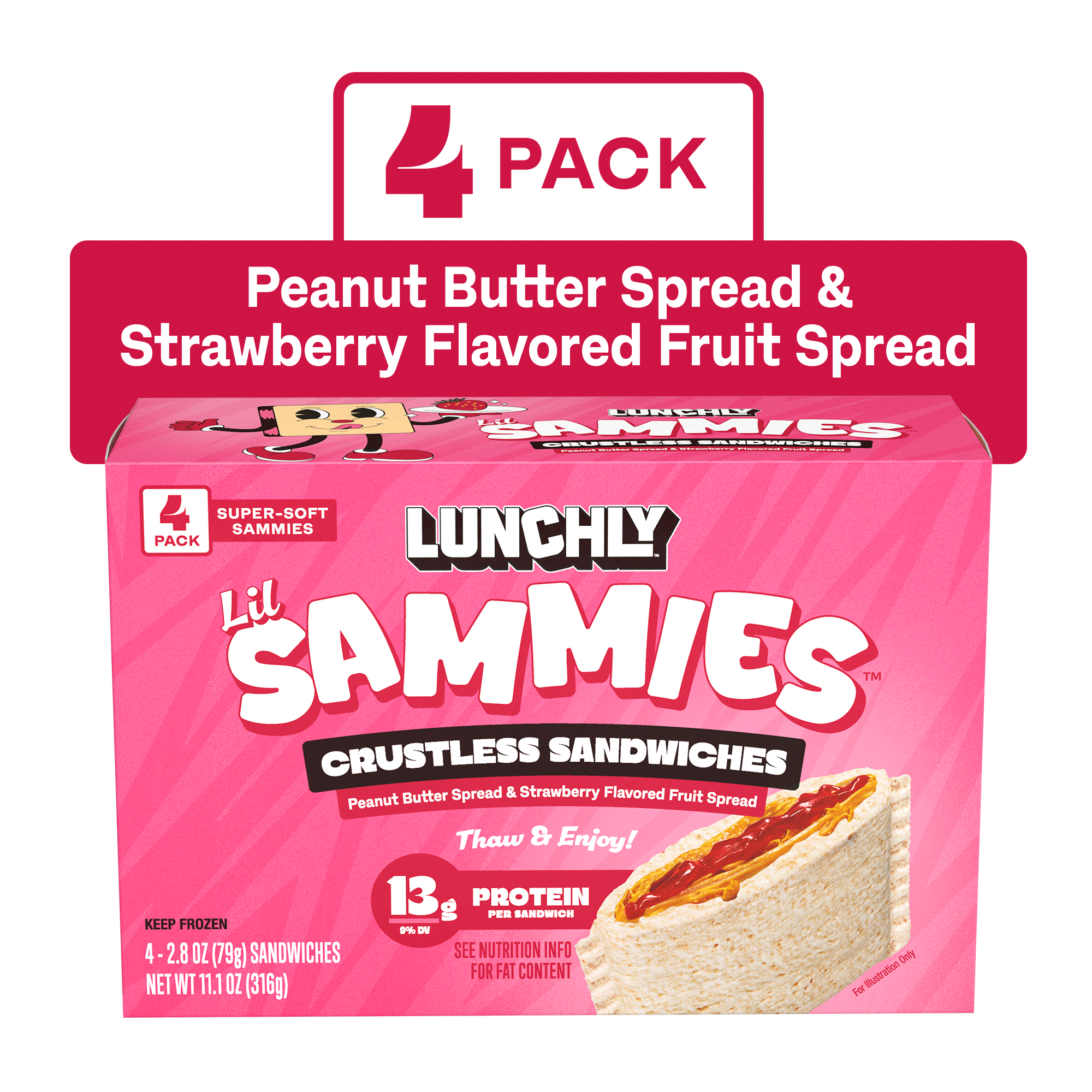
Peanut Butter & Strawberry Jelly
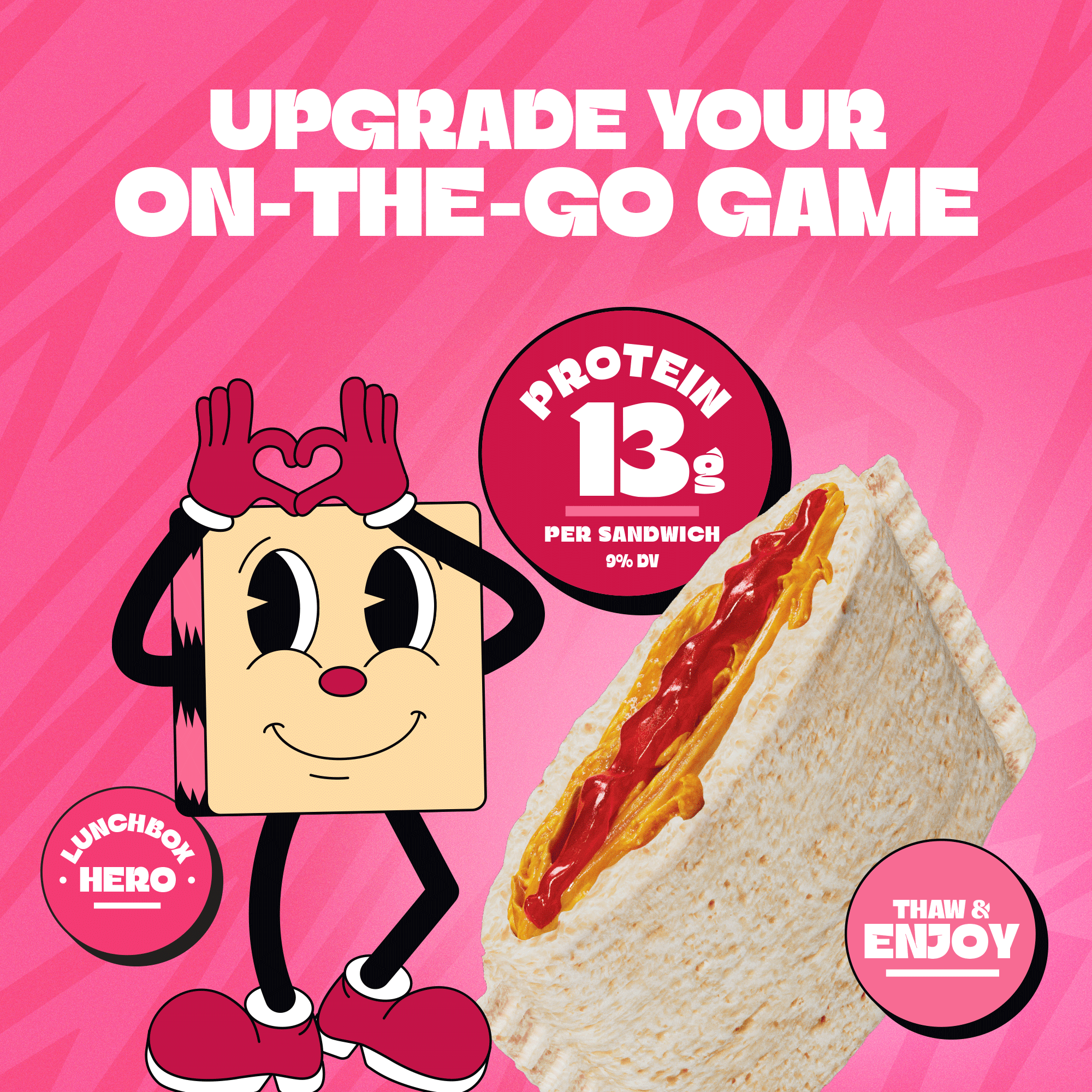
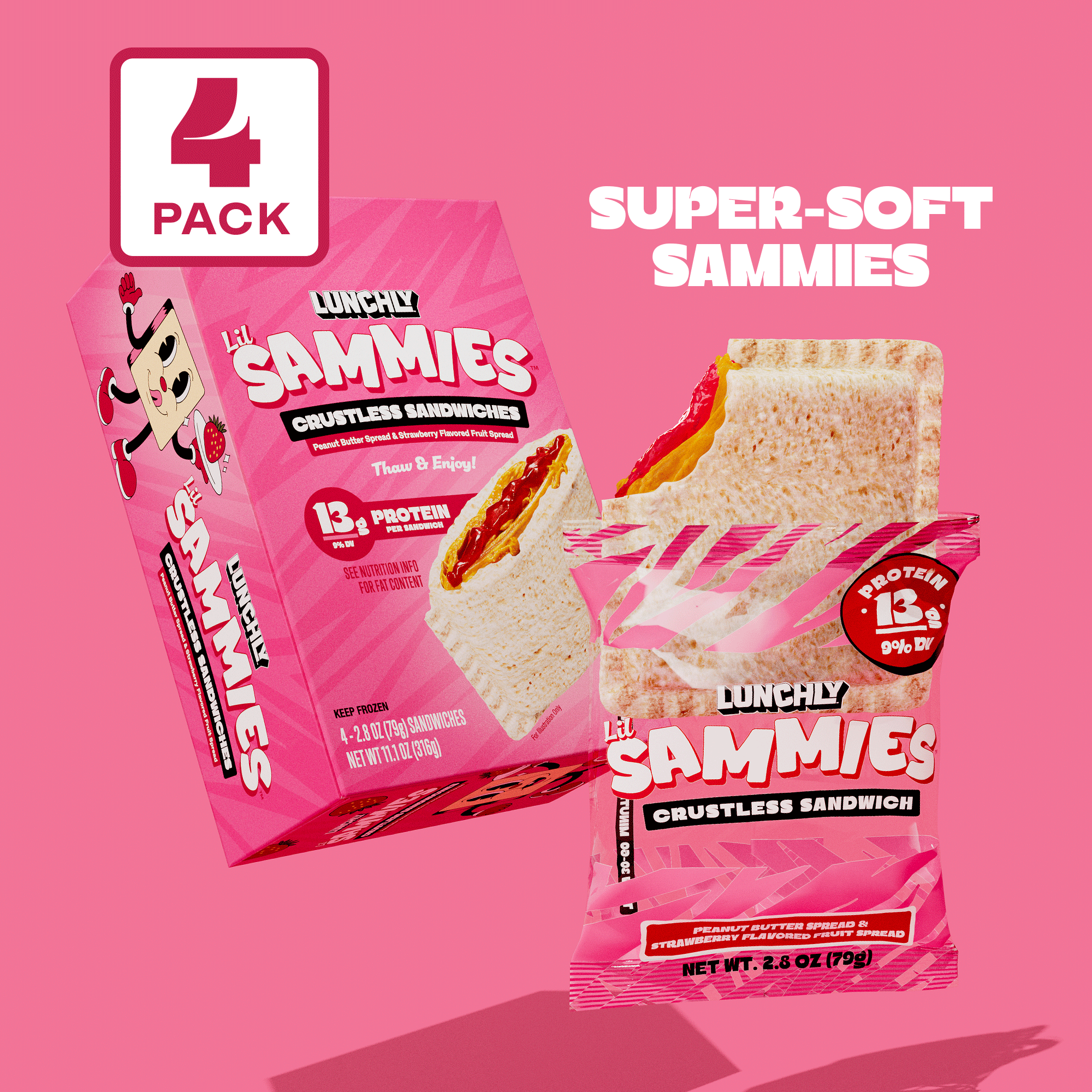
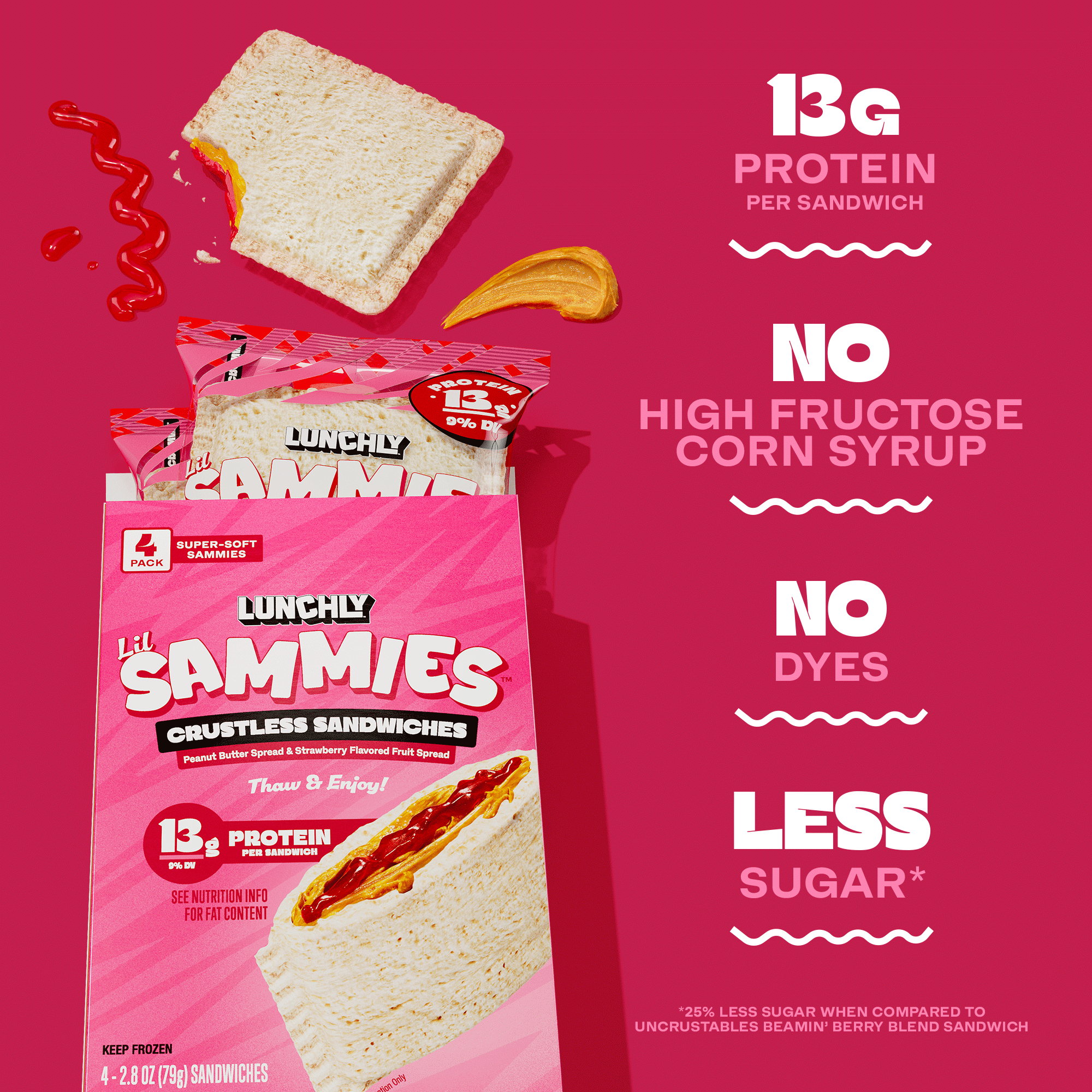
Bright pink and red create a playful, high-energy flavor identity while strawberry cues bring appetite appeal and immediate differentiation to the lineup.
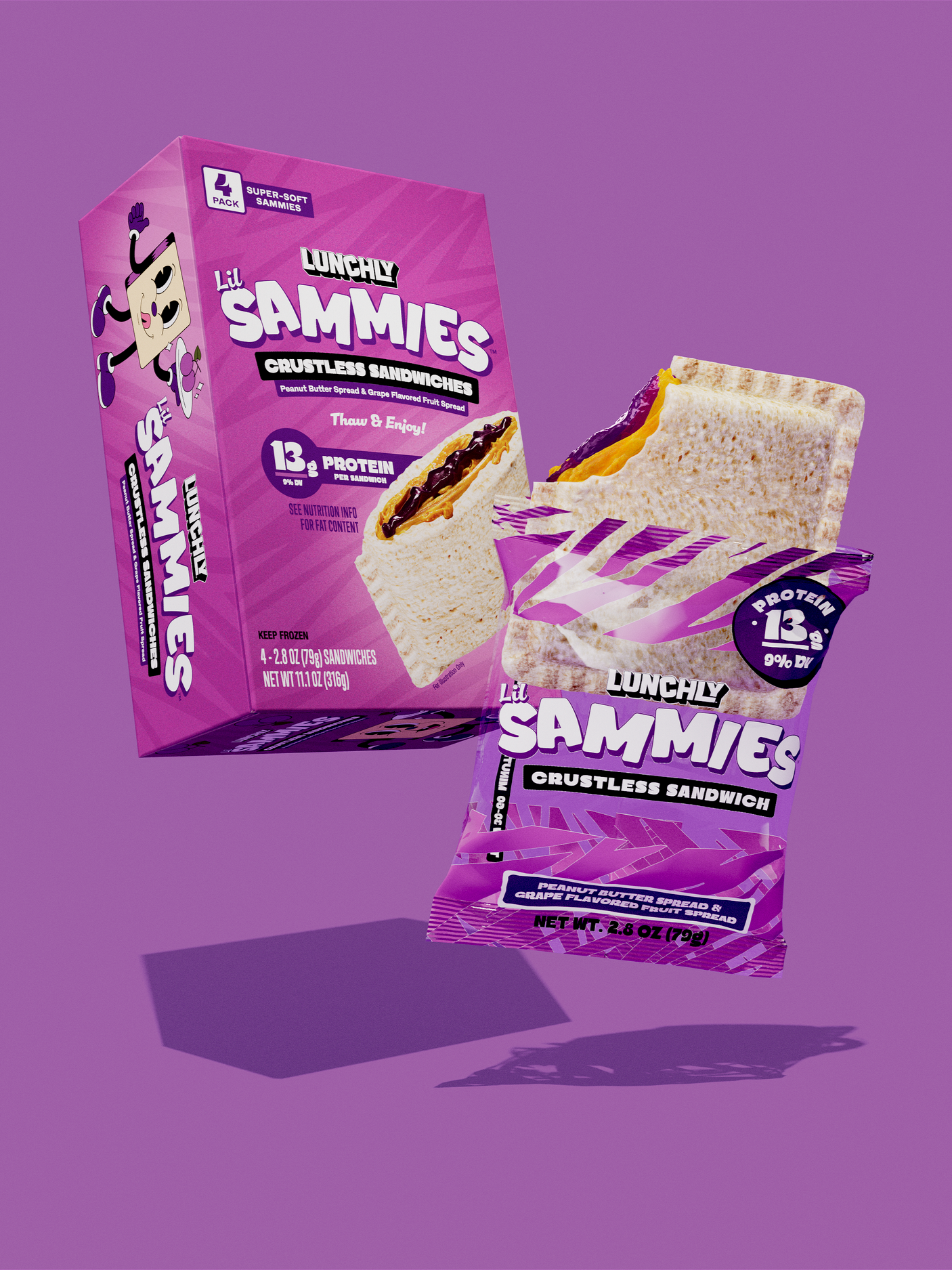
Peanut Butter & Grape Jelly
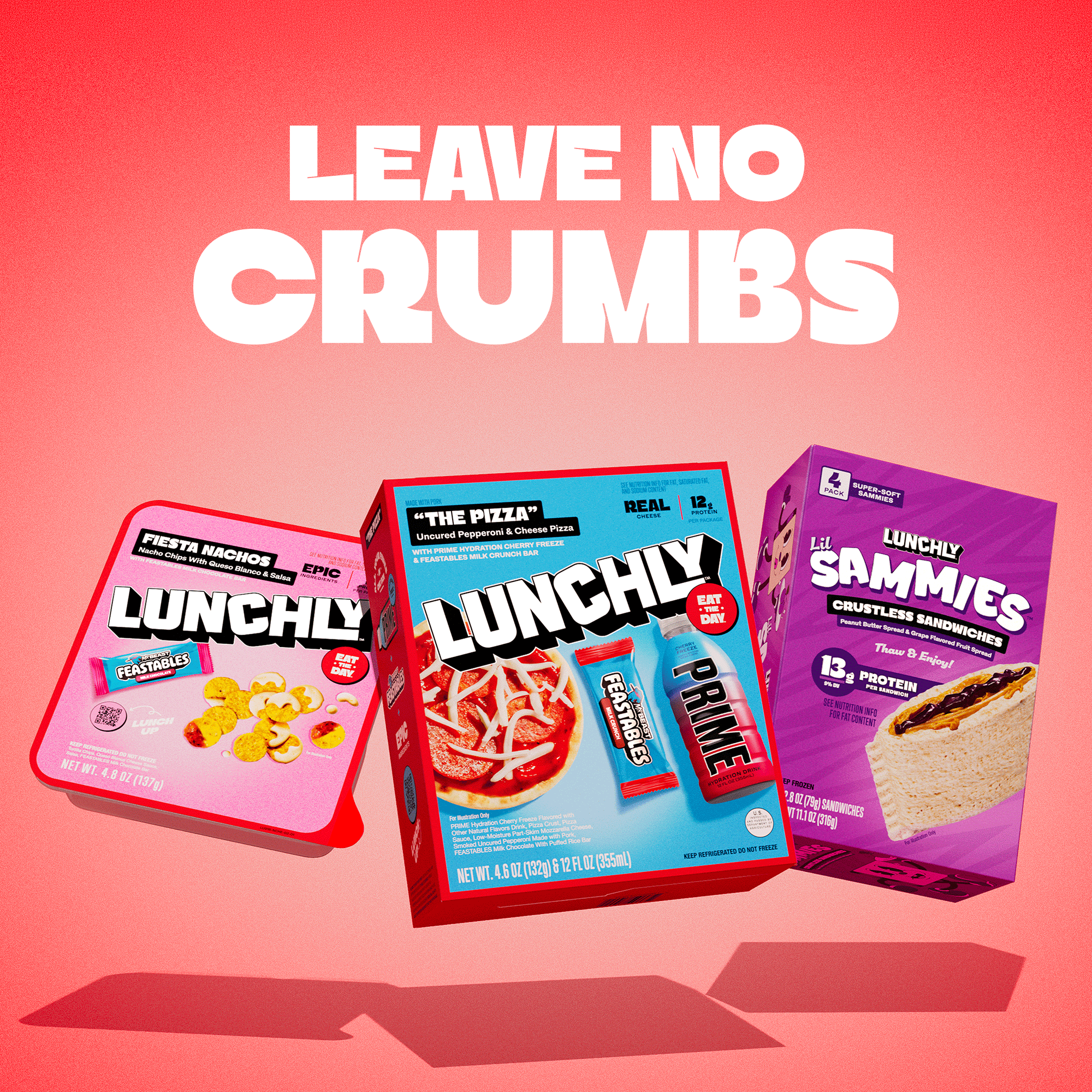
Deep purples give Grape its own distinct flavor world while the shared architecture, typography and product imagery keep it connected to the larger system.
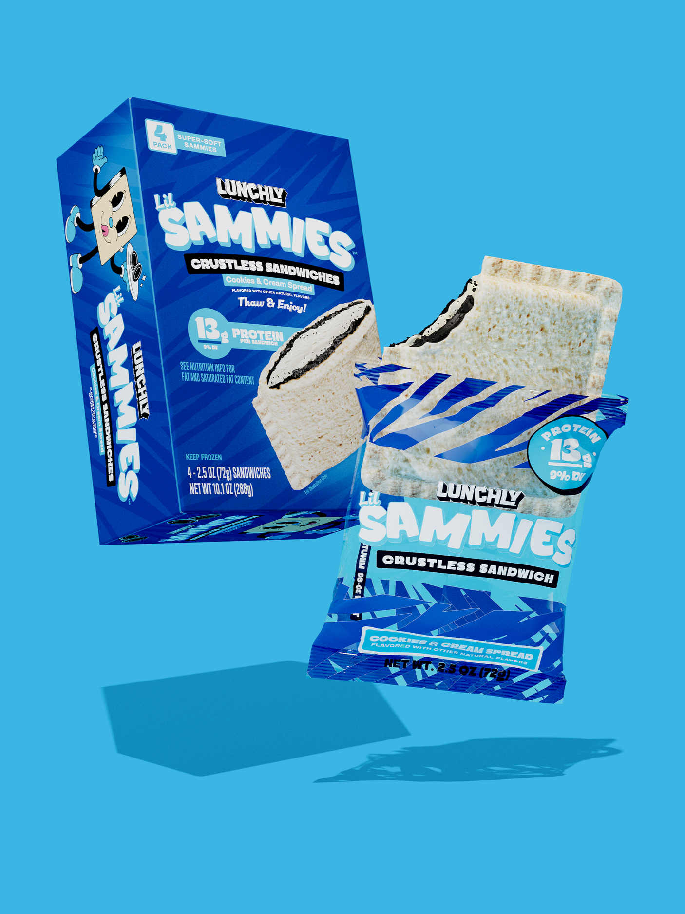
Cookies & Cream Spread
Electric blue gives Cookies & Cream a distinctive identity within the lineup and signals that it is the system’s more unexpected flavor. Crisp black-and-white ingredient cues reinforce the cookies-and-cream profile, while the shared package architecture keeps it unmistakably part of the Lil Sammies family.
Extending the System to E-commerce
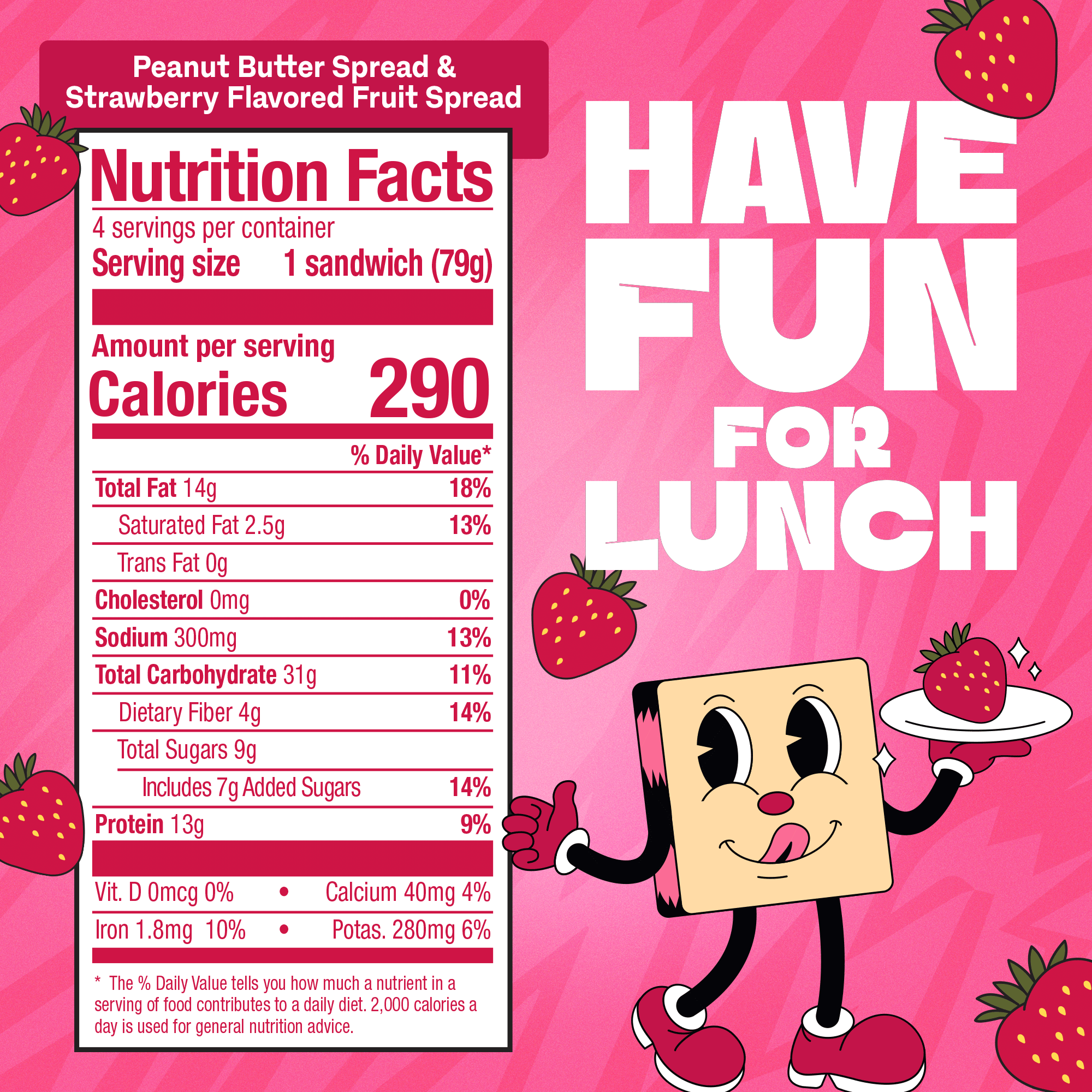
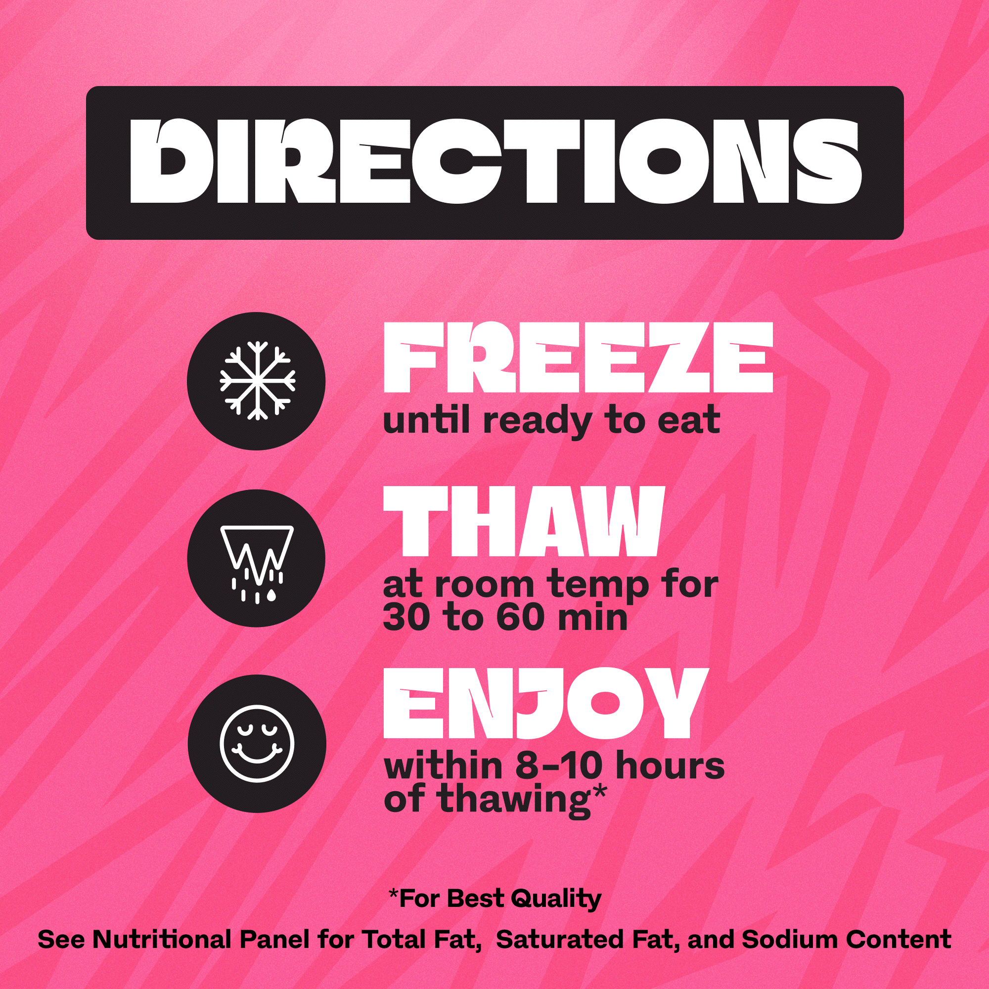
As the launch expanded into e-commerce, the broader creative team explored multiple CG directions that needed to feel cohesive with the existing Lunchly site and brand assets. I developed several concepts as part of that exploration, and one of my directions was selected for the final launch imagery.
I then worked directly with the CG artist to develop the selected concept through final execution, directing composition, product presentation, packaging, flavor cues and overall visual consistency with the Sammies packaging system.